
This chart of the week shows map of the World as seen from Australia, in Hobo-Dyer projection. Quite unfamiliar view, if you live in Europe—like I do—and are accustomed to Europe-centered, North on the top, Mercator projection maps.
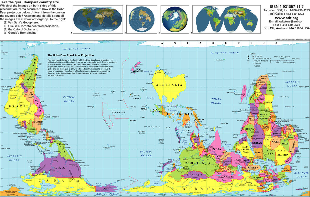
Any map is a model of reality, imperfect representation of things, based on a set of assumptions and conventions. Mercator projection is very useful for certain purposes and it was invented for them. It is preserving angles, and thus local directions and shapes, making it indispensable for navigation. North on the top, South on the bottom is a useful convention. However, it comes with a cost—it inflates the size of objects away from the equator. Russia, Canada, and especially Greenland and Antarctica look much bigger than they are. XCKD jokingly proposed a Madagascator projection, which designed solely to exaggerate size of Madagascar through using unorthodox specifications of projection).
We keep similar mental maps for many things and navigate them so routinely, that we take assumptions and conventions for granted. Navigating complex issues requires comparing and aligning our mental maps. Such a comparison could help us to see the issue on various maps and find a joint way forward.