Turbulent events of history leave sharp marks in demographic structure. Demographic history could tell us a lot about historical events…providing we could get necessary data. Demographic portal recently start offering access to relatively long time series for a broad range of countries. It also offers possibility to construct heatmaps of mortality changes (detailed description is available in Russian), which is an excellent tool for tracking historical changes.
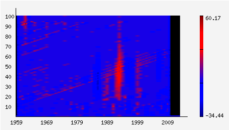
Chart for Russia 1959-2010 (male) is clearly shows heavy impact of 1990s. The blood-red spot shows increased mortality in all ages, especially in working age–consequences of transitional shock. One could also note positive impact of Gorbachev’s anti-alcohol campaign, a blue spot around 1985. It shows declining mortality of working age men. Unfortunately campaign was not long enough (and not very well implemented).
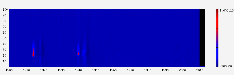
France 1900-2010 clearly shows two red cradles of mortality hikes during WWI and WWII and more or less monotonous decline of mortality for the rest of period.