Dancing with the Vowels

Many years ago my son was struggling with the Pythagoras theorem in school. He simply was unable to get it. We tried different approaches, and finally I suggested “Why won’t you dance it?  Or play it on your guitar?” (He was very much in torturing the Les Paul that time)
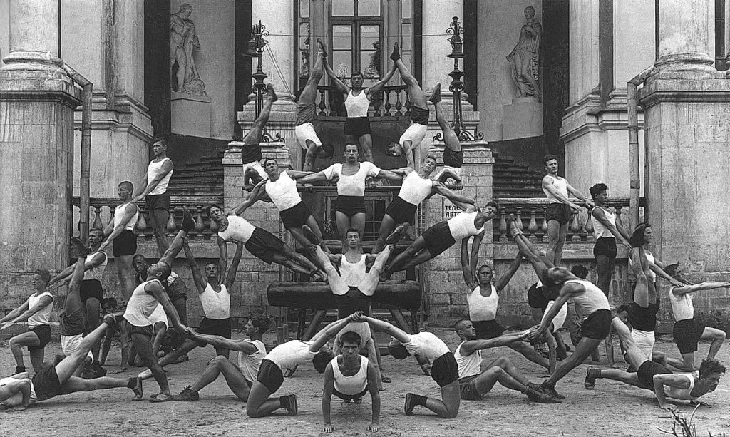
Human Pyramide, USSR, 1928, Source: https://kulturologia.ru/blogs/240419/42917/

While the idea could be a radical, it makes a lot of sense. When we work with data, with numbers, we are dealing with  abstractions. This could be useful, no doubt. But it also could be deprived of meaning. 

— Your greatest weakness?
— Interpreting semantics of a question but ignoring the pragmatics
— Could you give an example?
— Yes, I could. 

As a Chemistry Teacher by the first degree, I was trained to provide relatable examples to chemical phenomena, which could be too small or too big to comprehend. You could have a hard time to imagine an atom, they are too small. But I could tell you that if the electron orbit around the the hydrogen atom (5.29×10⁻¹¹ m or 52.9 pm) would be scaled to the size of stadium (football field is usually 100 meters long and 60 meters wide, Beşiktaş Arena building is 220 by 165 m), then the hydrogen nucleus (1.70×10⁻¹⁵ m or 1.70 fm) will be of size of .. a small berry (some 5×10⁻³ m or 5 mm), not even a ball (7×10⁻¹ m or 70 cm). As a home work you could compare sizes of the Sun and the Earth orbit 😉

This week I ran across “datasculptures”, a physical and visual representation of data, in this case–the complete history of one river. To quote the author, the approach is a  form of counter-mapping, both tactile and sensible, but also involving a slow-making process and another kind of relationship to the data and the river it concerns. Sculpting environmental data is a proposition to map geographical entities that go around the “from above” and “far away” traditional views to open new ways of re-embedding time and materiality into cartographies.

LOIRE’S RIVER FLOW HISTORY (MONTHLY DATA 1960-2022)


This could be pure fun on the bun! In 2018 I attended a breathtaking summer school on Analysis of Linguistic Data (LingDan). We played around with different data related to language–sounds, words, signs. I used a Romanian / Moldovan tongue twister consisting of vowels only “oaia aia e a oaiei ei” (meaning “that sheep belongs to that sheep”).  The interesting thing about vowels is that they differ systematically in the frequencies of so-called “formant” sounds, so you could record, measure and map them.  I thought it could be a good idea to show the “dance” of vowels–movement of sounds in a tongue twister–and produced a short data video.  I also coaxed the fellow Dance Lab, who were in the next block, into human dancing about it. 

Coming back to the Pythagoras theorem, one way to show it is a hydraulic sculpture. Another way is through visual puzzles, which could provoke a very good discussion in the classroom.

P.S. You could also check my “Numbers in a context” artish project

Disaggregation Dizziness

Still Life with Apples and Oranges, 1895 by Paul Cezanne

Recently I had a great pleasure and honor to attend the International conference on the implementation of a national system for monitoring the Sustainable Development Goals. The conference brought together statisticians, policy makers, and international organizations to discuss how to challenges in measuring sustainable development, in monitoring of SDGs. Everybody asked for better data disaggregation, for each indicator (let me remind you that current SDG monitoring framework contains 230 indicators). Statisticians listened this with caution, then did back of the envelope calculations and discovered that they would need to calculate each of 230 indicators for some 40+ groups, if take into account all break downs proposed (by sex, poverty status, disability status, and so on and so on, and this does not include territorial division, which could be different for each country). These number make you dizzy. Without doubts, it will put enormous pressure on Statistical Services, who still are looking for ways to produce all required SDG indicators (as significant part of them are still in Tier II or III, i.e. “established methodology and standards available but data are not regularly produced” and “no established methodology and standards“).

Without doubts, disaggregation of indicators is indispensable, especially to ensure that Sustainable Development Goals leave no one behind.  The issue is how to balance costs and opportunities?

First, it should be clarity on why, how, and what we disaggregate. The groups we identify—”women”, “rural”, “children”—are not that heterogeneous as we tend to think. These identities are not unique, often combined, resulting in very different people being counted under the same category—compare, for instance, situation of “Roma low educated woman with disabilities living in rural settlement” and “highly-educated woman living in economic center“. Trying to imaging all possible combinations makes you dizzy and inevitably ruins your friendship with statistician. In many cases the line between groups is also very blurry, while statisticians prefer crisp definitions. Possible solution is proposed by Todd Rose in “The End of Average: How We Succeed in a World That Values Sameness“. Instead of mundane “aggregate then analyze” you should “analyze then aggregate“. Being applied wisely, this approach could bring great results—it allowed Mexico to estimate Human Development Index for very diverse groups, including internal migrants; and us to compare and understand social exclusion of different people in Europe and Central Asia.

Second, we should ensure that data collection instruments include all necessary information for future disaggregation. This issues is not that trivial as it seems. For instance, many indicators calculated on the basis of household surveys—like poverty rates or calories consumption—could be gender-blind (or, more precisely gender-myopic) as these surveys do not catch intra-household distributions and inequalities. Collecting ethnic-related data could be challenging not only due to fluid and double identities, but also due to national regulations. Some hard to reach groups—who tend to be left behind—could be simply left out of statistics viewpoint. At the same time, providing geographical information offers great opportunities in linking with other data sources and getting more disaggregated, nuanced picture.

Last but not the least, we should promote practice and culture of data use. Statistical offices are very busy with data collection, production, and dissemination. If you peek into statistical yearbooks, you will find indicators tabulated for dozens of different groups. However, this is a role of scholars to do additional analysis, explore possible disaggregations, and perhaps suggesting statistical services useful revisions of regular tables. In Serbia collaboration of  Social Inclusion and Poverty Reduction Unit of the Government, Statistical Office with UNDP resulted in set of studies, which help formulating efficient public policies for social inclusion.