Could Kyrgyzstan be first to send people on Mars?

Had a great pleasure to facilitate the “Modelling for the SDGs” workshop organized by UNDP Kyrgyzstan this Saturday, 14 October 2023, a vital step in the collective journey to achieve the Sustainable Development Goals in Kyrgyzstan and CentralAsia. We combined different tools to explore possible futures.
We are using the International Futures Model by Frederick S. Pardee Center for International Futures for trends projections.
We also explored an IMPOSSIBLY good and bad futures, Utopia and Dystopia–Kyrgyzstan being the first to send people on Mars; and country fully depopulated by the Martian Plague. For this exploration we used Future Backwards method by The Cynefin Company (formerly Cognitive Edge)
It was great to see how tools help unlocking the deep discussion and spot the turning points in the journey to future(s)

Dancing with the Vowels

Many years ago my son was struggling with the Pythagoras theorem in school. He simply was unable to get it. We tried different approaches, and finally I suggested “Why won’t you dance it?  Or play it on your guitar?” (He was very much in torturing the Les Paul that time)

Human Pyramide, USSR, 1928, Source: https://kulturologia.ru/blogs/240419/42917/

While the idea could be a radical, it makes a lot of sense. When we work with data, with numbers, we are dealing with  abstractions. This could be useful, no doubt. But it also could be deprived of meaning. 

— Your greatest weakness?
— Interpreting semantics of a question but ignoring the pragmatics
— Could you give an example?
— Yes, I could. 

As a Chemistry Teacher by the first degree, I was trained to provide relatable examples to chemical phenomena, which could be too small or too big to comprehend. You could have a hard time to imagine an atom, they are too small. But I could tell you that if the electron orbit around the the hydrogen atom (5.29×10⁻¹¹ m or 52.9 pm) would be scaled to the size of stadium (football field is usually 100 meters long and 60 meters wide, Beşiktaş Arena building is 220 by 165 m), then the hydrogen nucleus (1.70×10⁻¹⁵ m or 1.70 fm) will be of size of .. a small berry (some 5×10⁻³ m or 5 mm), not even a ball (7×10⁻¹ m or 70 cm). As a home work you could compare sizes of the Sun and the Earth orbit 😉

This week I ran across “datasculptures”, a physical and visual representation of data, in this case–the complete history of one river. To quote the author, the approach is a  form of counter-mapping, both tactile and sensible, but also involving a slow-making process and another kind of relationship to the data and the river it concerns. Sculpting environmental data is a proposition to map geographical entities that go around the “from above” and “far away” traditional views to open new ways of re-embedding time and materiality into cartographies.

LOIRE’S RIVER FLOW HISTORY (MONTHLY DATA 1960-2022)


This could be pure fun on the bun! In 2018 I attended a breathtaking summer school on Analysis of Linguistic Data (LingDan). We played around with different data related to language–sounds, words, signs. I used a Romanian / Moldovan tongue twister consisting of vowels only “oaia aia e a oaiei ei” (meaning “that sheep belongs to that sheep”).  The interesting thing about vowels is that they differ systematically in the frequencies of so-called “formant” sounds, so you could record, measure and map them.  I thought it could be a good idea to show the “dance” of vowels–movement of sounds in a tongue twister–and produced a short data video.  I also coaxed the fellow Dance Lab, who were in the next block, into human dancing about it. 

Coming back to the Pythagoras theorem, one way to show it is a hydraulic sculpture. Another way is through visual puzzles, which could provoke a very good discussion in the classroom.

P.S. You could also check my “Numbers in a context” artish project

Upside down map?

This chart of the week shows map of the World as seen from Australia, in Hobo-Dyer projection. Quite unfamiliar view, if you live in Europe—like I do—and are accustomed to Europe-centered, North on the top, Mercator projection maps.

Any map is a model of reality, imperfect representation of things, based on a set of assumptions and conventions. Mercator projection is very useful for certain purposes and it was invented for them. It is preserving angles, and thus local directions and shapes, making it indispensable for navigation. North on the top, South on the bottom is a useful convention. However, it comes with a cost—it inflates the size of objects away from the equator. Russia, Canada, and especially Greenland and Antarctica look much bigger than they are. XCKD jokingly proposed a Madagascator projection, which designed solely to exaggerate size of Madagascar through using unorthodox specifications of projection).

We keep similar mental maps for many things and navigate them so routinely, that we take assumptions and conventions for granted. Navigating complex issues requires comparing and aligning our mental maps. Such a comparison could help us to see the issue on various maps and find a joint way forward.

7 Data Storytelling Tips From Centuries-Old Data Visualization

Data visualization has a long history, hundreds of years. Data designers coaxed numbers into telling stories and giving us insight into the world around us. Here are seven lessons learned:

1. Keep the Focus on the Data

2. Label for Comprehension

3. Choose the Most Effective Data Visualization

4. Tell a Comprehensive Story

5. Order data for comprehension

6. Compare for Context

7. Make it Beautiful

https://www.columnfivemedia.com/7-data-storytelling-tips-from-centuries-old-data-visualization/

Sustainable Development Goals as a Network of Targets

12009662_882179671871702_8487110901368455942_n[1]Sustainable Development Goals, to be adopted by the United Nations summit at the end of September 2015, will set up international development agenda for next 15 year till 2030. SDGs are making a serious step forward from their ancestor, Millennium Development Goals. Lack of integration across sectors in terms of strategies, policies and implementation has long been perceived as one of the main pitfall of previous approaches to sustainable development. SDGs offer more comprehensive and more integrated approach sustainable development. The backside of this more complex agenda is necessity to understand internal links and trade-offs, both explicit and implicit.

One way to embrace complexity is too look on SDGs as a network of targets:

Another way to embrace complexity is to consider extended SDG Goals, which include not only targets listed under each goal (which reflect long negotiation and consultation process rather than internal logic), but also those from other Goals logically linked to the current goal. Here area a couple of examples:

SGD1 Poverty reduction
SDG1: Core
SDG1: Extended

SGD8 Growth and Jobs
SDG8: Core
SDG8: Extended

also see Goals 1, 10 and 8 highlighted
Cluster of 1, 8, 10, and 16 (extended)

Some themes—like migration—do not have a specific goal, they are related to a number of  targets, linked to different goals.

Indicators to measure SDGs should also take into accounting this complexity

Innovative visualization to explore compelxity of SDGs as a layered network (codename “Funky Octopus”)

See also:

Creative Commons License
SDGs as a network of targets by Mike Peleah is licensed under a Creative Commons Attribution-NonCommercial-ShareAlike 4.0 International License.
Based on a work at https://peleah.me/sdgs-as-network/.

Demographic history and Mortality heatmaps

Turbulent events of history leave sharp marks in demographic structure. Demographic history could tell us a lot about historical events…providing we could get necessary data. Demographic portal recently start offering access to relatively long time series for a broad range of countries. It also offers possibility to construct heatmaps of mortality changes (detailed description is available in Russian), which is an excellent tool for tracking historical changes.
Chart for Russia 1959-2010 (male) is clearly shows heavy impact of 1990s. The blood-red spot shows increased mortality in all ages, especially in working age–consequences of transitional shock.  One could also note positive impact of Gorbachev’s anti-alcohol campaign, a blue spot around 1985. It shows declining mortality of working age men. Unfortunately campaign was not long enough (and not very well implemented).


russia-mortality-map

France 1900-2010 clearly shows two red cradles of mortality hikes during WWI and WWII and more or less monotonous decline of mortality for the rest of period.

france-mortality-map

Food basket a century ago: Great Britain vs Russia

Infographics was born in the very exact moment when prehistoric man drew on the wall of the cave a buffalo and hunters, explaining something to his fellow tribesmen. Most probably, they have now proper language, but inforgraphics was already there. The years passed. At the turn of the last century, in 1912, the publishing house «Vestnik Zaninija» in St. Petersburg has published the book «Rossija v cifrah. Strana. Narod. Soslovija. Klassy» (i.e. «Russia in the figures. Country. People. Estates. Classes») authored by Nikolai Alexandrovich Rubakin. The book contains various statistical data on what was then the Russian Empire, as well as comparisons with other countries of the then World. It provides in particular revealing picture on weekly family budgets of English manual laborer (a family of 3 persons and an annual budget of 450 rubles) and locksmith from Nizhny Novgorod (family of 3 persons and an annual budget of 400 rubles).

Chart is in Russian, but it is easily understandable. English manual laborer is on left side and locksmith from Nizhny Novgorod is on right side. Labels from top to bottom reads as the following:

  • Tea 1/2 lb vs 1/10 lb
  • Butter 1 lb vs 1/2 lb
  • Sugar 4 1/2 lb vs 2 1/2 lb
  • Vegetable oil nil vs 3 lb
  • Meat and lard 4 1/2 lb vs 3 1/2 lb
  • Potatoes 8 lb vs 10 lb
  • Vegetables (cost) 4 kop. vs 10 kop. (100 kop. = 1 ruble)
  • White bread and flour 19 1/2 lb vs 19 lb
  • Back bread  nil vs 14 lb

On a deserted, wave-swept shore, He stood – in his mind great thoughts grow


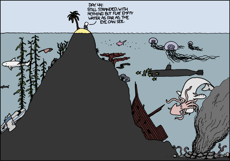
While sitting on a beautiful hill and overlooking the tranquil expanse of water, it is difficult to notice the pulse of life there, in the depths. Sometimes on the surface appear ripple-like patterns from whales’ tails or submarine periscopes, which could provide only a sketchy idea of the life in depths. Over time, scientists have created a number of tools to explore the depths, which fall into one of two large groups. In the first case, we catch a particular instance from the abysmal depths and study it in details. However, we do not care how numerous are such specimens, how they interact in the ecosystem and so on. In the second case, we consider the system as a whole — we track shoals of fish, water flow or distribution of volcanic emissions. In that case, we care little to none what happens to specific instances, we are interested in macro-phenomena.

In the social sciences, we use exactly the same tools — roughly speaking, case studies and statistics, each having their own pros and cons.
Case studies (focus groups, in-depth interviews and other similar methods) allow looking deeper into the problem, describing it in detail and in colors, highlighting some features that are difficult to see otherwise. However, such stories are not representative, and reflect the particular specific case. We have too many variables in our society, and it is too hard to pick a «typical representative» (try to find «a typical representative of your country» or «a typical country in Central Asia»), and there is no guarantee that that his or her experience would be typical.

On the other hand, namely statistics, operating with large numbers, can highlight the typical cases, trends and other average values, by which you can judge a society as a whole. The trouble is that most of these indicators gives an understanding of underwater life, roughly speaking, by ripple-like patterns from whales’ tails or submarine periscopes. Razor of research hypotheses completely cuts out the flesh of meaning from the bones of numbers.

There are numerous and repeated attempts to befriend a variety of tools that would give us understanding what’s going on in the depths of society. For example, the article «Managing Yourself: Zoom In, Zoom Out», published in the Harvard Business Review, offers a very simple approach — zoom in or out of the problem as a map in Google Maps. When the map is zoomed out, one can see the mountain ridges, state borders and big highways. When the map is zoomed in, these are dropped out of sight, but one can distinguish individual neighborhoods, streets, and houses. At zoom out one can see the problem in context, while zooming in allow to see important details that are blurred in zoom out.

Cognitive Edge offers a similar tool, which brings together stories, «micro-narratives» and the meta-data about these stories. In this case, research hypotheses do not play a major role. Certain «patterns» of stories begin to emerge when a large number of stories is collected and plotted around certain metadata options — whether the story about the past, present, or future? Is the story about corruption, cooperation or competition? In this case, accuracy of the sample is not so important — whether in the cluster 400 or 401 story does not matter at all. What is more important is appearance of such a cluster. It is possible to go in more deeply analysis, using the layers of clusters by adding variables — demographic characteristics of the storytellers, the emotional background of stories, and so on. Moreover, the tool allows you to «dive» deep into the cluster and catch the specific history, thus merging the statistics and personal experience .

This combination is very useful — politicians and decision makers rarely hear the voice of the people, relying on public opinion studies, and other average values. Using this tool allow one, sitting on the hill, to observe the beat of life at all stages of program or project — analysis, design , implementation, monitoring and evaluation.
This article is also featured in Voices from Eurasia, available in Russian.